The Deeper Meaning Behind Brand Colors
The Deeper Meaning Behind Brand Colors
If you are anywhere along your branding journey you may have wondered about your brand color palette and what it means. Here at n'Atelier, we like to match our clients' values to the colors in their brand design. We can match your values with colors by understanding the meaning behind each color.
Color is incredibly important in telling your story and reaching the right people for your business because color can evoke many feelings, emotions, and history. Even a slight tweak of color can create a very polarizing effect. However, the meaning behind colors is not necessarily a straightforward answer.
Depending on the culture that you come from or the culture of the audience you are hoping to reach, colors can mean very different things. This guide covers some of the basic color meanings from a Western perspective but, feel free to use your intuition to decipher what the colors mean to you. Maybe do a little digging into your own cultural lineage and see how they perceive certain colors too.
Warm Colors: Often reflect a feeling of energy, passion, happiness, and optimism.
Red
Red can have some polarizing effects. It has been associated with heat, anger, and danger but on the flip side can represent passion. It also represents grounding, loyalty, courage, and a fiery spirit.
In China, it represents prosperity and happiness and in some Eastern countries is worn by brides. It can be uplifting and energizing as an accent color, I would recommend not using it super heavily.
Magenta
Magenta represents the rare, creative, stylish, nonconformist, eccentric, and sassy.
This is a beautiful accent color.
Yellow
Yellow is bright and energizing, often associated with joy and happiness. It also represents hope. A free spirit, optimism, intelligence, and an open heart.
Yellow can be polarizing in a similar way to red so consider a softer shade if using as a main color.
Pink
Pink represents being open, kind, loving, charming, giving, gentle, romantic, sweet, and nurturing.
It can be an excellent color to communicate connection and warmth but has a softer feeling than red.
Orange
Orange is often associated with autumn. It represents vibrant, energetic, movement, being driven, social, confident, fearless, youthful, and fun-loving. It also represents health and vitality because of its association with fruit.
Orange is less intense than red with a similar warming effect and can be used more broadly.
Cool Colors: Associated with the night and the moon, usually evoke a cool and calming, relaxing and reserved feeling.
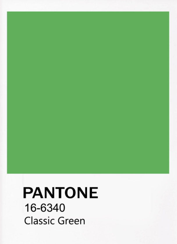
Green
Down to earth, fresh and new, abundance, driven, quick-witted, inspiring, mischievous, sane.
Can be energizing like yellow or more soothing like blue. Green is an appropriate color for brands associated with wealth, health, and stability.
Turquoise
Turquoise is a color representing those who are spiritual, intuitive, warm, gifted, personable, or nurturing.
Violet
This bright shade of purple represents the innovator, connector, manifestor, imaginative, wise, truthful, wealthy, and luxurious.
Blue
Meaning can vary greatly based on the shade of blue. It can represent sadness, calm, responsibility, peace, and spirituality.
Blue is a great color to use if you are a peacemaker, a natural healer, an empath, and you are loyal, talented, or kind.
Purple
Purple is a combination of red and blue and has attributes of both.
It used to be a color of the royals because the dye to make purple was incredibly expensive. It represents royalty, passion, and creativity.
Lavender
This lighter shade of purple represents the introverted, daydreamers, the mysterious, highly intelligent individuals, and soft spirits. Lavender is also a great representation of springtime and romance.
Neutrals: Generally used as a backdrop in most brand designs to let the bolder colors pop but these add a sense of sophistication and calm.
Black
Black represents power, elegance, and formality. It also is associated with evil, death, the occult, mystery, edginess, rebellion, certainty, and authority. It can evoke a feeling of “don’t look at me” and going into hiding.
Black is often used as an accent color in typography or details of a brand. It can pair with nearly any color.
Grey
Grey symbolizes the conservative, formality, modernity, intellect, and compromise. It also represents wisdom and refinement,
Grey can be moody and depressing but it can also be a softer replacement for whites or blacks, It can have a calming or subduing effect.
Beige and Tan
These two shades of brown represent piety, calm, flexibility, and conservatism.
Beige and tan can feel warm or cool depending on what other colors surround them. They are also often used as an accent or background color and amplifies the colors surrounding them.
White
Like black, white can also go with any color. It symbolizes purity, cleanliness, virtue, and reflection.
It can brighten and project other colors that it is surrounded by. This is a great background color to help the other colors in your palette pop.
Brown
Brown represents the Earth, wood, stone, and nature. It stands for personalities who are reliable, steadfast, and grounded.
Brown is usually used in the background but can be a softer replacement for black.
Cream and Ivory
These two colors are generally calming and cooler in tone, They are associated with history and time passed. They represent elegance, calm, relaxation, purity, and softness.
When paired with other neutrals they can take on a sense of earthiness.
In conclusion,
colors can take on many different meanings and associations depending on where in the world they are and how they are combined with other colors. Use your intuition to guide you and use this guide as a framework for getting started.
To dive deeper consider performing a meditation with a color you are considering. Bring the color into your mind's eye as you take deep breaths. Imagine that you are completely surrounded by the color. How does it make you feel? Notice these colors in your everyday life and take note of what emotions come up for you. Then you can use this information to determine which colors suit you and your brand best.
If you would like further guidance on building out your brand color palette, take a look at our step by step brand alchemy guide
Or feel free to book a 1:1 consultation with us for further guidance.


